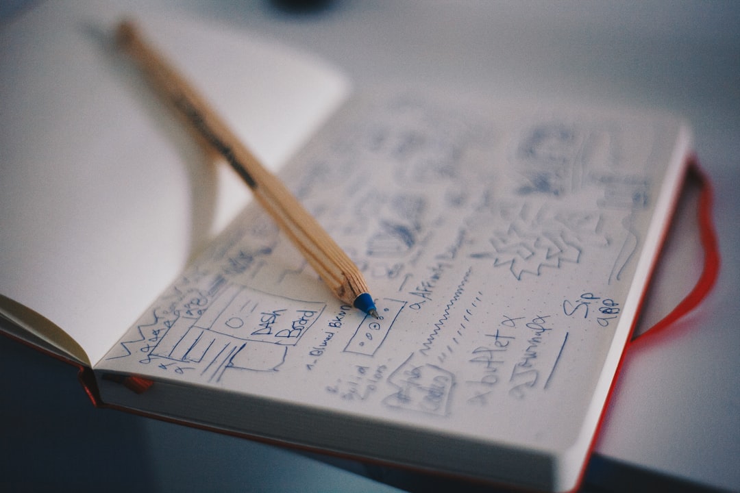
A useful brand moodboard does more than collect attractive images: it turns research into a shared visual direction for logo design and the wider identity system. This guide explains how to build one, evaluate references, brief collaborators, and keep stakeholders focused on a deliberate creative route.
Overview
A brand moodboard is a curated set of visual references that communicates how a brand should feel before the logo, typography, color palette, and supporting assets are finalized. It is an early decision-making tool, not a finished identity concept. The strongest boards help people discuss direction using concrete examples instead of vague descriptions such as “modern,” “premium,” or “friendly.”
For a logo project, the board should make the intended character clearer without prescribing the final mark. It may suggest a level of simplicity, a visual rhythm, a photographic attitude, a color temperature, or a relationship between type and symbol. It should not imply that the selected references will be copied.
Begin with brand strategy rather than browsing. Clarify the audience, positioning, personality, practical applications, and boundaries of the project. A technology product might need to feel capable and approachable; a specialist consultancy may need authority without appearing formal or distant. These decisions determine which visual references are useful. If the positioning is unclear, review a brand positioning framework before collecting images.
What belongs on a brand moodboard?
- Imagery: photography, illustration, environments, people, objects, or editorial compositions that express the intended mood.
- Typography cues: examples of serif, sans-serif, display, condensed, or humanist forms. Use them as directional references, not as an unapproved font selection.
- Color cues: broad color relationships, contrast levels, saturation, and light or dark balance rather than an assumed final palette.
- Texture and material: paper, grain, geometry, gradients, lines, patterns, or surfaces that could influence the identity system.
- Composition: spacing, scale, alignment, cropping, repetition, and the amount of visual density.
- Exclusions: visual traits the project should avoid, such as overly decorative lettering, generic technology imagery, or low-contrast layouts.
Keep the board focused. A smaller set of related references is generally easier to interpret than a crowded collection of unrelated styles. Add a short note beside each important reference explaining the specific quality it demonstrates.
Checklist by scenario
For a new logo or startup brand identity
- Write a one-sentence creative question, such as: “How can this identity feel confident and clear without looking corporate?”
- Collect references from outside the immediate category as well as within it. This can reveal useful visual principles without encouraging category sameness.
- Include examples of how the direction might work in practice: a website header, product interface, social profile, presentation cover, or packaging surface.
- Separate strategic references from decorative ones. A striking image is not useful if it does not support the brand’s audience or promise.
- Mark the elements that should remain flexible. The final logo may use a different color, type treatment, or symbol while preserving the intended character.
For a SaaS or digital product logo
- Show how the direction could survive at small sizes, including a browser icon, app icon, avatar, or compact navigation layout.
- Check whether the references rely too heavily on familiar software symbols, abstract gradients, or interchangeable geometric marks.
- Include interface and landing-page examples to test hierarchy, contrast, whitespace, and the relationship between logo and product UI.
- Consider both light and dark contexts. A moodboard that works only on a white canvas may lead to problems in real applications.
- For broader context, compare the board with a practical SaaS branding strategy.
For a website redesign or campaign concept
- Define whether the board is extending an existing identity or proposing a temporary campaign expression.
- Use references that demonstrate landing-page branding, content hierarchy, image treatment, motion cues, or calls to action.
- Protect recognizable brand assets. A campaign can introduce a new mood without making the core logo, voice, or color system feel disconnected.
- Test the direction against real content rather than placeholder text alone.
- Review the landing page branding guide when the moodboard will guide conversion-focused pages.
Reusable moodboard brief template
Copy this structure into a project document before collecting references:
- Project: name, product, campaign, or identity stage.
- Audience: who should recognize themselves in the direction?
- Desired perception: three to five qualities the brand should communicate.
- Must avoid: visual clichés, tones, colors, or category conventions that would weaken the position.
- Applications: where the logo and identity will appear first.
- Reference sources: links, creator credits, and licensing notes.
- Decision: what the board should help the team approve.
Inspiration board, style tile, or identity concept?
| Tool | Purpose | Typical contents | Approval question |
|---|---|---|---|
| Inspiration board | Explore a broad territory | Images, textures, color impressions, cultural references | Is this a promising direction to investigate? |
| Style tile | Make a focused visual direction tangible | Provisional type, color, UI or layout examples, graphic details | Does this visual language fit the strategy? |
| Finished identity concept | Present a designed solution | Logo, rules, applications, refined typography and color | Is this the identity to develop and deploy? |
What to double-check
Evaluate each reference, not just the overall impression
Use a simple scorecard to prevent the loudest or most attractive image from controlling the discussion. Score each reference from 1 to 5, then add a short explanation:
| Criterion | Question |
|---|---|
| Strategic fit | Does it support the audience, positioning, and intended perception? |
| Distinctiveness | Does it create useful separation from familiar category patterns? |
| Transferability | Could the principle work in a logo, website, presentation, and social asset? |
| Clarity | Can stakeholders explain what quality the reference contributes? |
| Practicality | Can the direction be produced, maintained, and used accessibly? |
Double-check image rights before publishing or distributing the board beyond internal discussion. Save the source link, creator information, and any licensing notes. A reference can be appropriate for internal exploration while being unsuitable for final marketing use. When using a design tool, keep source material, working files, approvals, and final exports organized separately.
Review accessibility early. Contrast, legibility, type size, and color dependence should be considered as directional constraints, even though the moodboard is not a finished interface. A visually subtle direction may need stronger contrast in application. Use the brand accessibility checklist before the direction moves into production.
Finally, check whether the board describes a coherent system or only a collection of individual images. Ask what repeats across the references: rounded forms, generous spacing, documentary photography, high-contrast type, restrained color, or another identifiable principle. Those repeated qualities are more valuable than any single picture.
Common mistakes
- Starting with trends: A current-looking reference may not support the brand’s long-term position. Start with audience and purpose.
- Mixing incompatible directions: Three unrelated visual territories create debate without a decision. Separate distinct routes into separate boards.
- Using labels instead of evidence: “Premium” does not explain whether the direction depends on restraint, material quality, typography, scale, or color.
- Choosing references that are too literal: A picture of a cloud, lock, or dashboard does not automatically provide a useful idea for a software logo.
- Designing the final logo on the moodboard: Early exploration should clarify intent, not create premature attachment to an untested mark.
- Ignoring application context: A board that looks good as a collage may fail in navigation, small icons, print, or real content.
- Letting every stakeholder add images: Collect input through a defined process, then curate it against the brief.
- Presenting too many routes: A focused recommendation makes approval easier than an archive of every possible style.
When the board is approved, document what was approved and what was not. The decision might concern mood, composition, typography behavior, image treatment, or color direction rather than a specific reference. This record creates a cleaner bridge into the logo design process and later brand guidelines.
When to revisit
Revisit the moodboard whenever the inputs change, not simply because new visual trends appear. Useful review points include the start of a seasonal planning cycle, a new product launch, a website redesign, a change in audience, a naming decision, or a rebrand discussion. For a broader identity change, use the rebrand strategy checklist before replacing the existing direction.
Also review it when the workflow or design tools change. File links may break, source images may become unavailable, collaboration permissions may change, or a team may begin working in a different format. Keep an exportable, dated version of the approved board and maintain a short decision log.
Before your next project begins, take these final actions:
- Restate the audience, positioning, and desired perception in one paragraph.
- Choose one focused visual territory, or create clearly separated alternatives.
- Curate references across imagery, type, color, texture, and composition.
- Annotate why each core reference belongs.
- Run the scorecard and remove references that fail strategic or practical tests.
- Check licensing records, accessibility risks, and real application contexts.
- Record the approved principles before moving into logo sketches or style tiles.
A moodboard earns its place in the logo design process when it reduces ambiguity. Treat it as a decision tool with a brief, a clear owner, and an intentional review cycle, and it can keep designers and stakeholders aligned from early research through the final visual identity system.